Tilt Card
3D tilt card for React: leans toward the pointer with a soft sheen and a drifting photo. Lightweight, no animation library.
- Micro-interactions
- Travel & hospitality
- React only · 0 deps
- 1 file
Browser support · All evergreen browsers. Pointer only; touch and reduced motion keep the card flat. Photos are plain URLs you pass in; if one fails to load, a soft gradient stays in its place. The demo uses /demo/*.webp, swap in your own files.
Install. One command, or copy the file.
$
npx shadcn@latest add https://freedesignmd.com/r/tilt-card.json- Byte-identical to the preview
- No Tailwind or config needed
- SSR-safe · keyboard accessible
- Respects reduced motion & transparency
components/micro-interactions/tilt-card.tsx
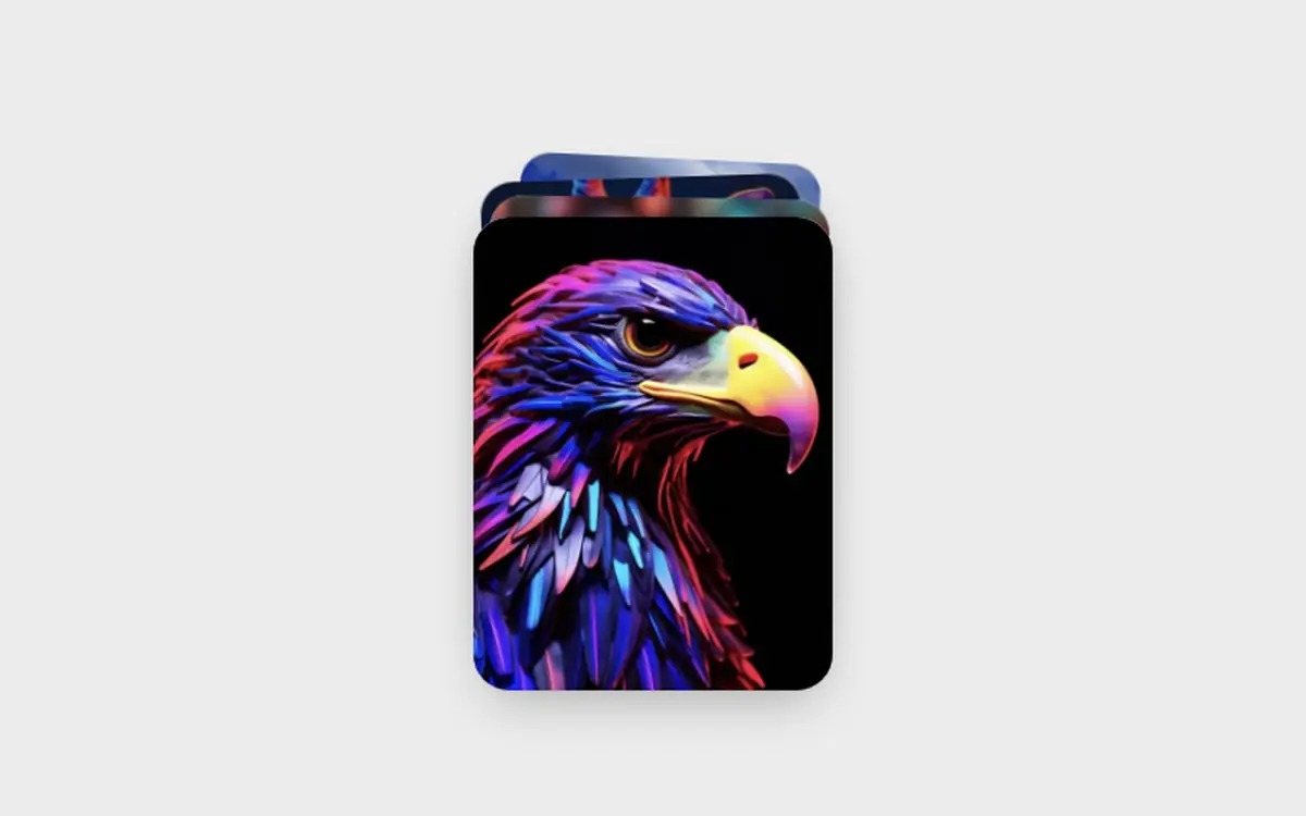
1/**2 * TiltCard, a photo card that leans toward the pointer in 3D, with a soft3 * light sheen that follows it and the picture drifting slightly behind.4 *5 * Props: src, title, caption, width (px, default 260), ratio (height / width,6 * default 1.3), max (max tilt in degrees, default 11), sheen (boolean).7 * CSS vars: --fd-tc-radius.8 *9 * Browser support: all evergreen browsers. Pointer values are written as CSS10 * variables straight to the element, so moving the pointer never re-renders.11 * Accessibility: decorative motion only; the card content is plain text and an12 * image. Reduced motion and touch: the card stays flat.13 */14import { useRef, useState } from "react";15import type { PointerEvent } from "react";16 17export interface TiltCardProps {18 src?: string;19 title?: string;20 caption?: string;21 width?: number;22 ratio?: number;23 max?: number;24 sheen?: boolean;25 className?: string;26}27 28export function TiltCard({29 src,30 title,31 caption,32 width = 260,33 ratio = 1.3,34 max = 11,35 sheen = true,36 className,37}: TiltCardProps) {38 const el = useRef<HTMLDivElement>(null);39 const [ok, setOk] = useState(true);40 41 const move = (e: PointerEvent<HTMLDivElement>) => {42 const node = el.current;43 if (!node || e.pointerType === "touch") return;44 const r = node.getBoundingClientRect();45 const px = (e.clientX - r.left) / r.width;46 const py = (e.clientY - r.top) / r.height;47 node.style.setProperty("--rx", `${((0.5 - py) * 2 * max).toFixed(2)}deg`);48 node.style.setProperty("--ry", `${((px - 0.5) * 2 * max).toFixed(2)}deg`);49 node.style.setProperty("--mx", `${(px * 100).toFixed(1)}%`);50 node.style.setProperty("--my", `${(py * 100).toFixed(1)}%`);51 node.style.setProperty("--px", `${((px - 0.5) * -14).toFixed(1)}px`);52 node.style.setProperty("--py", `${((py - 0.5) * -14).toFixed(1)}px`);53 node.dataset.live = "";54 };55 const leave = () => {56 const node = el.current;57 if (!node) return;58 delete node.dataset.live;59 for (const k of ["--rx", "--ry", "--px", "--py"]) node.style.removeProperty(k);60 };61 62 return (63 <div className={`fd-tc${className ? ` ${className}` : ""}`} style={{ width }}>64 <style>{css}</style>65 <div66 ref={el}67 className="fd-tc-card"68 data-sheen={sheen || undefined}69 style={{ height: Math.round(width * ratio) }}70 onPointerMove={move}71 onPointerLeave={leave}72 onPointerCancel={leave}73 >74 <span className="fd-tc-photo">75 {src && ok ? <img className="fd-tc-img" src={src} alt="" draggable={false} decoding="async" onError={() => setOk(false)} /> : null}76 </span>77 <span className="fd-tc-shade" />78 <span className="fd-tc-sheen" />79 {(title || caption) && (80 <span className="fd-tc-text">81 {title ? <span className="fd-tc-title">{title}</span> : null}82 {caption ? <span className="fd-tc-caption">{caption}</span> : null}83 </span>84 )}85 </div>86 </div>87 );88}89 90const FONT = `ui-sans-serif,-apple-system,BlinkMacSystemFont,"Segoe UI",Roboto,Helvetica,Arial,sans-serif`;91const css = `92.fd-tc,.fd-tc *,.fd-tc *::before,.fd-tc *::after{box-sizing:border-box}93.fd-tc{--fd-tc-radius:24px;--fd-ease-out:cubic-bezier(0.22,1,0.36,1);display:block;margin:0;padding:0;perspective:900px;font:400 14px/1.4 ${FONT};color:#fff}94.fd-tc-card{position:relative;display:block;margin:0;padding:0;border-radius:var(--fd-tc-radius);overflow:hidden;background:linear-gradient(160deg,#dcd0c8,#9aa3b8);box-shadow:0 1px 2px rgba(0,0,0,.1),0 22px 40px -16px rgba(0,0,0,.4);transform:rotateX(var(--rx,0deg)) rotateY(var(--ry,0deg)) scale(1);transition:transform 700ms var(--fd-ease-out),box-shadow 700ms var(--fd-ease-out);transform-style:preserve-3d;will-change:transform}95.fd-tc-card[data-live]{transform:rotateX(var(--rx)) rotateY(var(--ry)) scale(1.03);transition:transform 120ms linear,box-shadow 300ms;box-shadow:0 1px 2px rgba(0,0,0,.1),0 34px 50px -18px rgba(0,0,0,.5)}96.fd-tc-photo{position:absolute;inset:-14px;display:block;margin:0;padding:0;transform:translate3d(var(--px,0px),var(--py,0px),0);transition:transform 700ms var(--fd-ease-out)}97.fd-tc-card[data-live] .fd-tc-photo{transition:transform 120ms linear}98.fd-tc-img{position:absolute;inset:0;display:block;width:100%;height:100%;margin:0;padding:0;border:0;object-fit:cover;pointer-events:none}99.fd-tc-shade{position:absolute;inset:0;display:block;background:linear-gradient(180deg,transparent 55%,rgba(0,0,0,.5));pointer-events:none}100.fd-tc-sheen{position:absolute;inset:0;display:none;pointer-events:none;opacity:0;background:radial-gradient(420px circle at var(--mx,50%) var(--my,50%),rgba(255,255,255,.32),transparent 60%);mix-blend-mode:soft-light;transition:opacity 400ms}101.fd-tc-card[data-sheen] .fd-tc-sheen{display:block}102.fd-tc-card[data-live] .fd-tc-sheen{opacity:1}103.fd-tc-text{position:absolute;left:20px;right:20px;bottom:18px;display:flex;flex-direction:column;gap:3px;margin:0;padding:0;transform:translateZ(30px)}104.fd-tc-title{display:block;margin:0;padding:0;font:600 19px/1.2 ${FONT};letter-spacing:-.01em}105.fd-tc-caption{display:block;margin:0;padding:0;color:rgba(255,255,255,.78);font:400 13px/1.3 ${FONT}}106@media (prefers-reduced-motion:reduce){.fd-tc-card,.fd-tc-photo{transition:none;transform:none!important}}107@media (hover:none){.fd-tc-card,.fd-tc-photo{transform:none!important}}108`;109 110export function Demo() {111 return (112 <div className="fd-tcd">113 <style>{demoCss}</style>114 <TiltCard src="/demo/eagle-p.webp" title="Golden eagle" caption="Aquila chrysaetos" />115 </div>116 );117}118 119const demoCss = `120.fd-tcd,.fd-tcd *,.fd-tcd *::before,.fd-tcd *::after{box-sizing:border-box}121.fd-tcd{display:flex;align-items:center;justify-content:center;width:100%;min-height:100vh;margin:0;padding:48px 20px;background:#ececec;font:400 14px/1.4 ${FONT};letter-spacing:normal;overflow:hidden}122`;More Micro-interactions. Same file contract.
Questions about Tilt Card
Run npx shadcn@latest add https://freedesignmd.com/r/tilt-card.json, or open the page and copy the file into your project. It has zero dependencies besides React. What you copy is the exact file that renders the live demo.
3D tilt card for React: leans toward the pointer with a soft sheen and a drifting photo. Lightweight, no animation library. It is a free, MIT-licensed React micro-interactions component from the freedesignmd library.
Yes. It is free and MIT-licensed, use, modify and ship it in personal and commercial projects without attribution.
All evergreen browsers. Pointer only; touch and reduced motion keep the card flat. Photos are plain URLs you pass in; if one fails to load, a soft gradient stays in its place. The demo uses /demo/*.webp, swap in your own files.
Yes. It is a plain React component with its own styles, so it runs in Next.js, Vite, Remix and Lovable projects, and it needs no Tailwind setup. It has zero dependencies besides React.