Photo Sleeves
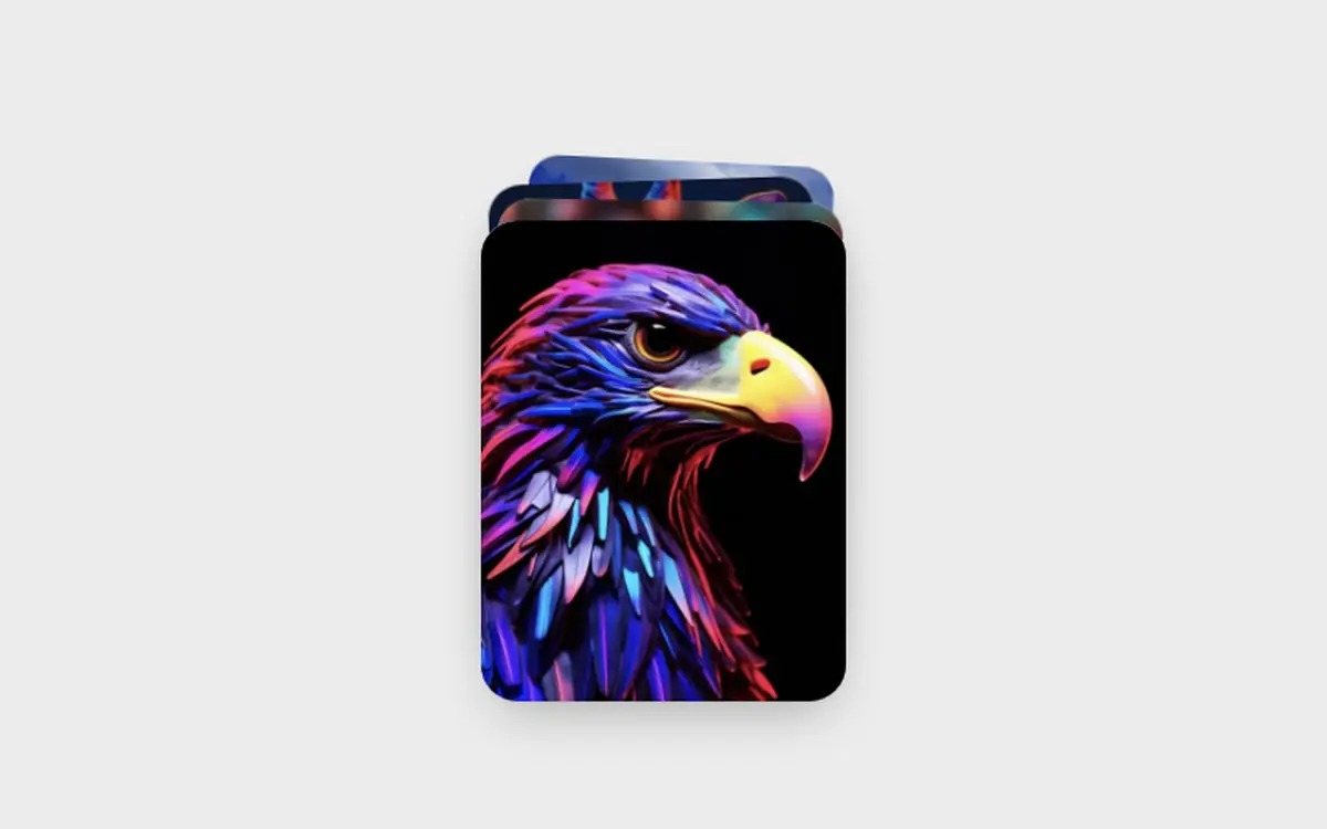
Photo album sleeves for React: pictures peek out, lift on hover and fan open on click. Frosted pocket, zero dependencies.
- Micro-interactions
- Photography
- React only · 0 deps
- 1 file
Browser support · All evergreen browsers; backdrop-filter falls back to a flat tint. Photos are plain URLs you pass in; if one fails to load, a soft gradient stays in its place. The demo uses /demo/*.webp, swap in your own files.
Install. One command, or copy the file.
$
npx shadcn@latest add https://freedesignmd.com/r/photo-sleeves.json- Byte-identical to the preview
- No Tailwind or config needed
- SSR-safe · keyboard accessible
- Respects reduced motion & transparency
components/micro-interactions/photo-sleeves.tsx
1/**2 * PhotoSleeves, record-sleeve albums with photos peeking out of the top.3 * Hover lifts the photos, a click fans them out above the sleeve.4 *5 * Props: albums[] ({ name, images[] }), photoWidth (px, default 104),6 * onOpen(index | null), aria-label.7 * CSS vars: --fd-ps-radius, --fd-ps-sleeve (sleeve tint).8 *9 * Browser support: all evergreen browsers; the sleeve uses backdrop-filter10 * and falls back to a flat tint without it.11 * Accessibility: every sleeve is a button with aria-expanded; Escape or a12 * click outside closes the open one. Reduced motion: no staggering.13 */14import { useEffect, useRef, useState } from "react";15 16const TONES = [17 "linear-gradient(160deg,#f3d1b8,#d7959a)",18 "linear-gradient(160deg,#c9d6f2,#8e9fd6)",19 "linear-gradient(160deg,#d3e6cf,#8fb996)",20 "linear-gradient(160deg,#f2e2b6,#d9b36b)",21];22 23export interface Album {24 name: string;25 images: string[];26}27 28export interface PhotoSleevesProps {29 albums: Album[];30 photoWidth?: number;31 onOpen?: (index: number | null) => void;32 className?: string;33 "aria-label"?: string;34}35 36export function PhotoSleeves({37 albums,38 photoWidth = 104,39 onOpen,40 className,41 "aria-label": label = "Photo albums",42}: PhotoSleevesProps) {43 const [open, setOpen] = useState<number | null>(null);44 const root = useRef<HTMLDivElement>(null);45 const photoH = Math.round(photoWidth * 1.32);46 const sleeveH = Math.round(photoH * 0.62);47 48 const set = (v: number | null) => {49 setOpen(v);50 onOpen?.(v);51 };52 53 useEffect(() => {54 if (open === null) return;55 const onKey = (e: globalThis.KeyboardEvent) => e.key === "Escape" && set(null);56 const onDown = (e: globalThis.PointerEvent) => {57 if (root.current && !root.current.contains(e.target as Node)) set(null);58 };59 window.addEventListener("keydown", onKey);60 window.addEventListener("pointerdown", onDown);61 return () => {62 window.removeEventListener("keydown", onKey);63 window.removeEventListener("pointerdown", onDown);64 };65 // eslint-disable-next-line react-hooks/exhaustive-deps66 }, [open]);67 68 return (69 <div70 ref={root}71 className={`fd-ps${className ? ` ${className}` : ""}`}72 role="group"73 aria-label={label}74 style={{ paddingTop: photoH + 24 }}75 >76 <style>{css}</style>77 {albums.map((album, a) => {78 const isOpen = open === a;79 const n = album.images.length;80 return (81 <div82 key={a}83 className="fd-ps-album"84 data-open={isOpen || undefined}85 data-dim={(open !== null && !isOpen) || undefined}86 style={{ width: photoWidth + 56, height: sleeveH + 14, zIndex: isOpen ? 5 : 1 }}87 >88 {album.images.map((src, i) => {89 const mid = (n - 1) / 2;90 const spread = (i - mid) * (photoWidth * 0.58);91 const tilt = (i - mid) * 7;92 return (93 <span94 key={i}95 className="fd-ps-photo"96 style={97 {98 width: photoWidth,99 height: photoH,100 "--rest": `${(i % 2 ? 1 : -1) * 2}deg`,101 "--x": `${spread}px`,102 "--r": `${tilt}deg`,103 "--i": i,104 background: TONES[(a + i) % TONES.length],105 } as React.CSSProperties106 }107 >108 <Img src={src} />109 </span>110 );111 })}112 <button113 type="button"114 className="fd-ps-sleeve"115 aria-expanded={isOpen}116 aria-label={`${album.name}, ${n} photos`}117 onClick={() => set(isOpen ? null : a)}118 style={{ height: sleeveH }}119 >120 <span className="fd-ps-name">{album.name}</span>121 <span className="fd-ps-count">{n}</span>122 </button>123 </div>124 );125 })}126 </div>127 );128}129 130function Img({ src }: { src: string }) {131 const [ok, setOk] = useState(true);132 if (!ok) return null;133 return <img className="fd-ps-img" src={src} alt="" draggable={false} loading="lazy" decoding="async" onError={() => setOk(false)} />;134}135 136const FONT = `ui-sans-serif,-apple-system,BlinkMacSystemFont,"Segoe UI",Roboto,Helvetica,Arial,sans-serif`;137const css = `138.fd-ps,.fd-ps *,.fd-ps *::before,.fd-ps *::after{box-sizing:border-box}139.fd-ps{--fd-ps-radius:18px;--fd-ps-sleeve:rgba(255,255,255,.55);--fd-ease-out:cubic-bezier(0.22,1,0.36,1);display:flex;flex-wrap:wrap;align-items:flex-end;justify-content:center;gap:28px 20px;margin:0;color:#111;font:400 14px/1.4 ${FONT}}140.fd-ps-album{position:relative;display:block;margin:0;padding:0;transition:opacity 300ms,filter 300ms}141.fd-ps-album[data-dim]{opacity:.45;filter:saturate(.7)}142.fd-ps-photo{position:absolute;left:50%;bottom:10px;display:block;margin:0;padding:0;border-radius:12px;overflow:hidden;box-shadow:0 1px 2px rgba(0,0,0,.1),0 10px 22px -8px rgba(0,0,0,.35);transform-origin:50% 100%;transform:translate3d(-50%,0,0) rotate(var(--rest));transition:transform 560ms var(--fd-ease-out);transition-delay:calc(var(--i) * 28ms)}143.fd-ps-album:hover:not([data-open]) .fd-ps-photo{transform:translate3d(-50%,-26px,0) rotate(calc(var(--rest) * 2))}144.fd-ps-album[data-open] .fd-ps-photo{transform:translate3d(calc(-50% + var(--x)),-70%,0) rotate(var(--r));transition-delay:calc(var(--i) * 40ms)}145.fd-ps-img{position:absolute;inset:0;display:block;width:100%;height:100%;margin:0;padding:0;border:0;object-fit:cover;pointer-events:none}146.fd-ps-sleeve{position:absolute;left:0;right:0;bottom:0;display:flex;align-items:flex-end;justify-content:space-between;gap:8px;margin:0;padding:14px 16px;border:1px solid rgba(255,255,255,.7);border-radius:var(--fd-ps-radius);background:var(--fd-ps-sleeve);-webkit-backdrop-filter:blur(14px) saturate(1.3);backdrop-filter:blur(14px) saturate(1.3);box-shadow:0 1px 1px rgba(255,255,255,.7) inset,0 12px 28px -12px rgba(0,0,0,.28);color:#1d1d1f;font:500 14px/1.2 ${FONT};letter-spacing:normal;text-align:left;cursor:pointer;appearance:none;-webkit-appearance:none;transition:transform 400ms var(--fd-ease-out)}147.fd-ps-sleeve:focus-visible{outline:2px solid #1a73e8;outline-offset:3px}148.fd-ps-album:hover:not([data-open]) .fd-ps-sleeve{transform:translateY(2px)}149.fd-ps-name{display:block;margin:0;padding:0}150.fd-ps-count{display:block;margin:0;padding:0;color:rgba(0,0,0,.45);font:400 13px/1.2 ${FONT};font-variant-numeric:tabular-nums}151@media (prefers-reduced-motion:reduce){.fd-ps-photo,.fd-ps-sleeve{transition:none}}152`;153 154export function Demo() {155 const a = ["eagle", "butterfly", "giraffe", "iguana"];156 const b = ["meadow", "ridge", "sunset", "balloons"];157 const c = ["eye", "aurora", "butterfly", "giraffe"];158 const url = (n: string) => `/demo/${n}-p.webp`;159 return (160 <div className="fd-psd">161 <style>{demoCss}</style>162 <PhotoSleeves163 albums={[164 { name: "Wildlife", images: a.map(url) },165 { name: "Landscapes", images: b.map(url) },166 { name: "Portraits", images: c.map(url) },167 ]}168 />169 </div>170 );171}172 173const demoCss = `174.fd-psd,.fd-psd *,.fd-psd *::before,.fd-psd *::after{box-sizing:border-box}175.fd-psd{display:flex;align-items:center;justify-content:center;width:100%;min-height:100vh;margin:0;padding:48px 20px;background:#ececec;font:400 14px/1.4 ${FONT};letter-spacing:normal;overflow:hidden}176`;More Micro-interactions. Same file contract.
Questions about Photo Sleeves
Run npx shadcn@latest add https://freedesignmd.com/r/photo-sleeves.json, or open the page and copy the file into your project. It has zero dependencies besides React. What you copy is the exact file that renders the live demo.
Photo album sleeves for React: pictures peek out, lift on hover and fan open on click. Frosted pocket, zero dependencies. It is a free, MIT-licensed React micro-interactions component from the freedesignmd library.
Yes. It is free and MIT-licensed, use, modify and ship it in personal and commercial projects without attribution.
All evergreen browsers; backdrop-filter falls back to a flat tint. Photos are plain URLs you pass in; if one fails to load, a soft gradient stays in its place. The demo uses /demo/*.webp, swap in your own files.
Yes. It is a plain React component with its own styles, so it runs in Next.js, Vite, Remix and Lovable projects, and it needs no Tailwind setup. It has zero dependencies besides React.