Liquid Glass in React: free components built from Apple's design guidelines
Apple's Liquid Glass, rebuilt for the web as 9 free React components. How the refraction works, which browsers get what, and how to use glass the way Apple's guidelines intend.
 Tammo ElsnerFounder of freedesignmd4 min read
Key takeaways
- 9 free Liquid Glass components for React, from a single lens to a tab bar, menu and bottom sheet.
- Chromium browsers get real refraction (SVG displacement inside backdrop-filter); Safari and Firefox get a frosted fallback with the same rim and highlights.
- Glass is a control layer: navigation and controls float on glass, content stays on solid surfaces.
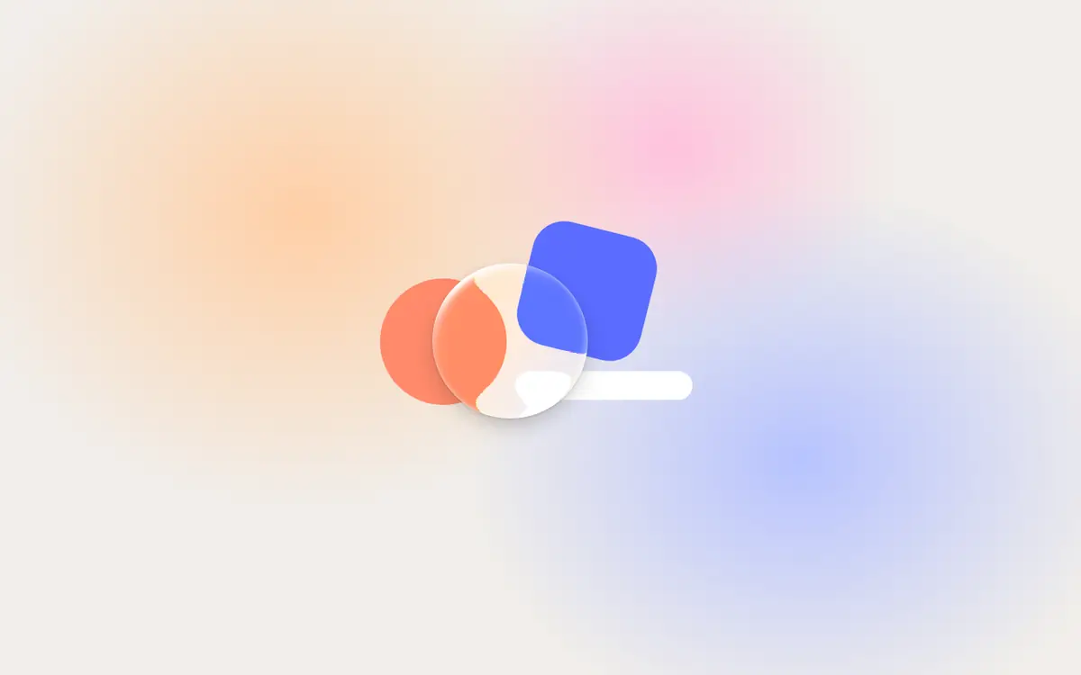
Apple's Liquid Glass is a material that bends the content behind it, like a real lens, instead of just blurring it. Most web versions stop at a frosted backdrop-filter. The Liquid Glass components on freedesignmd go further: 9 free Liquid Glass React components that compute real refraction, with a fallback that still looks right where browsers cannot.
The Liquid Glass React components
- Liquid Glass: Liquid Glass for React: a lens that refracts what is behind it, with squircle bevel, specular rim, dispersion and spring physics.
- Glass Button: Liquid Glass button for React: glass, prominent, clear and clear-prominent capsules in four sizes, with a springy press.
- Glass Tab Bar: iOS 26 style Liquid Glass tab bar: a lens springs between tabs, search sits apart, and the bar minimizes as you scroll.
- Glass Toggle: Liquid Glass toggle switch in the iOS 26 style: the knob swells into clear glass while pressed or dragged, then settles.
- Glass Slider: Liquid Glass slider: the thumb becomes refracting glass while dragged, stretches with velocity and springs back to solid.
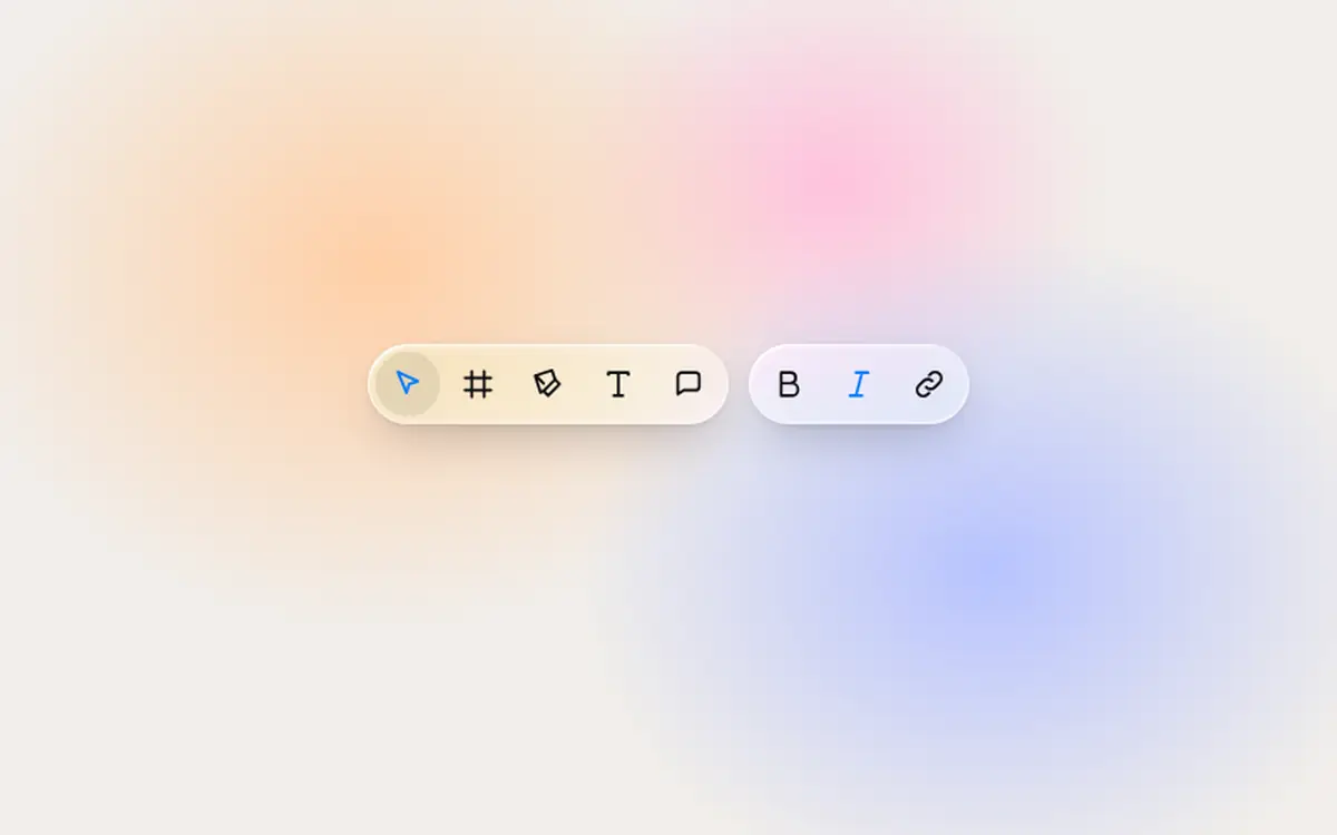
- Glass Toolbar: Liquid Glass toolbar for React: grouped controls with a sliding selection lens, labelled icons and a soft scroll-edge blur.
- Glass Menu: Liquid Glass menu: a glass button that morphs into its dropdown menu and back on a spring, with full keyboard support.
- Glass Sheet: Liquid Glass bottom sheet with detents: content peeks around it, and it turns edge-to-edge and more opaque at full height.
- Glass Media Controls: Liquid Glass media controls over video: transport, scrubber and volume capsules, with the HIG 35% dimming layer.
Every component has zero dependencies besides React and ships as a single file plus the shared liquid-glass.tsx core.
How the refraction works
Every pane computes its own refraction map. In Chromium browsers (Chrome, Edge, Arc, Brave) the map runs as an SVG displacement filter inside backdrop-filter, which shifts the pixels behind the pane the way curved glass would: straight in the middle, bent at the bevel. On top sit a specular rim and highlights.
Safari and Firefox do not apply SVG filters inside backdrop-filter, so they get a frosted blur with the same rim and highlights. The shape, the motion and the controls behave identically; only the lensing differs. The step-by-step version of this technique is in Liquid Glass CSS: how the effect works.
Use glass the way Apple's guidelines intend
The components follow four rules from Apple's Human Interface Guidelines. They matter more than the effect itself, because glass used everywhere stops looking like glass.
1. Glass is a functional layer
Glass floats above content for navigation and controls, never on the content itself. Tab bars, toolbars, menus, sheets and media controls: yes. Content cards, pricing tables and article text: no.
2. Regular and clear
Regular glass adapts its luminosity so labels stay legible. Clear glass sits over media, like video, with a 35% dimming layer behind the controls. Glass Media Controls shows the clear variant.
3. Fluid and concentric
Capsule shapes, concentric radii, buttons that morph into menus and knobs that turn to glass while you drag them. See Glass Menu and Glass Slider.
4. Accessible by default
Reduce Transparency, Increase Contrast and Reduce Motion are all handled, so the controls stay usable for people who switch the effect off.
Install a Liquid Glass component
Each component is a shadcn-compatible registry item. One command adds the component and the glass core to your project:
npx shadcn@latest add freedesignmd.com/r/glass-tab-bar.jsonIt works in Next.js, Vite, Remix, Lovable and anything else that runs React. You can also open any component page and copy the files by hand. How the registry and the pixel tests work is covered in shadcn registry components.
Liquid Glass vs glassmorphism
Glassmorphism is a frosted, translucent card: blur, a light border, a soft shadow. Liquid Glass adds refraction, a specular rim, dispersion and motion that responds to touch, and it is meant for the control layer only. If you want the older frosted look on dark backgrounds, the glossary has a page on dark glassmorphism.
Design systems and pages that use Liquid Glass
The Minimalistic design system is built around the same rule: monochrome chrome, one blue accent, and Liquid Glass reserved for navigation and controls. The Prism landing page template uses real Liquid Glass for its floating control layer over a drifting mesh backdrop.
Frequently asked questions
Written by Tammo Elsner
Founder of freedesignmd, a free DESIGN.md library for AI coding agents. About the project · LinkedIn