Liquid Glass CSS: how Apple's glass effect works on the web
Liquid Glass in CSS is three layers: a frosted backdrop-filter, an SVG displacement map that bends the backdrop, and a specular rim. How each layer works, where browsers differ, and how to keep it accessible.
 Tammo ElsnerFounder of freedesignmd4 min read
Key takeaways
- The frosted base is backdrop-filter blur and saturation, a translucent fill and a 1px specular rim.
- Real refraction comes from an SVG displacement map applied inside backdrop-filter, which Chromium supports.
- Safari and Firefox need a frosted fallback, and every glass surface needs reduced transparency and contrast styles.
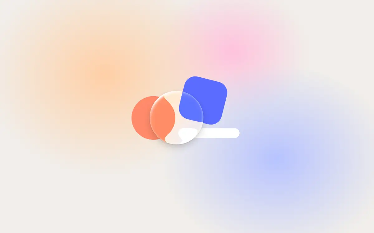
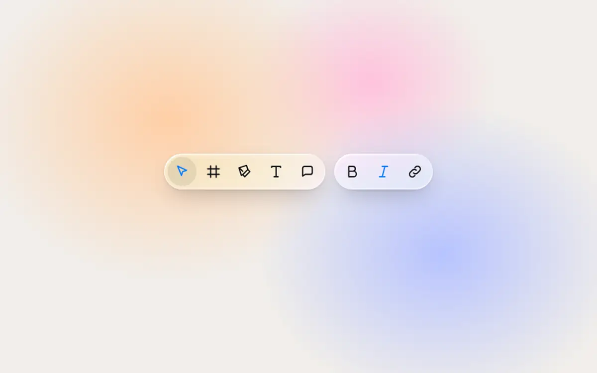
"Liquid Glass CSS" usually means a blurred, translucent box. That is half of it. Apple's material also bends what is behind it, catches light on its edge and reacts to touch. On the web you can get close with three layers: a frosted base, a refraction layer and a specular rim. Here is how each one works, written so you can build it or understand what the Liquid Glass React components do for you.
Layer 1: the frosted base with backdrop-filter
backdrop-filter applies filters to whatever is behind an element. Blur plus a saturation boost gives the frosted look, and a translucent fill keeps labels readable:
.glass {
  background: rgb(255 255 255 / 0.72);
  -webkit-backdrop-filter: blur(24px) saturate(180%);
  backdrop-filter: blur(24px) saturate(180%);
  border-radius: 9999px;
  /* 1px specular rim on top, hairline edge around */
  box-shadow:
    inset 0 1px 0 rgb(255 255 255 / 0.6),
    0 0 0 1px rgb(0 0 0 / 0.08),
    0 8px 24px rgb(0 0 0 / 0.12);
}
The numbers above (white at 72%, 24px blur, 180% saturation, a 1px rim) are the ones the Minimalistic design system specifies for its glass navigation and controls. This layer works in every current browser, which is why it is also the fallback.
Layer 2: refraction with an SVG displacement map
Frosting blurs the backdrop. Glass bends it. To bend it, you need a displacement map: an image where the red channel says how far to shift each pixel horizontally and the green channel how far vertically. Neutral (50%) means no shift. Draw the map so the center stays flat and the edges shift outward, and the backdrop curves at the bevel like a lens.
<svg width="0" height="0" aria-hidden="true">
  <filter id="lens" color-interpolation-filters="sRGB">
    <!-- map.png: red = x offset, green = y offset, 50% = no shift -->
    <feImage href="map.png" result="map" />
    <feDisplacementMap in="SourceGraphic" in2="map"
      scale="48" xChannelSelector="R" yChannelSelector="G" />
  </filter>
</svg>/* Chromium: refract the backdrop through the map */
.glass--lens {
backdrop-filter: url(#lens) blur(2px) saturate(180%);
}This is a simplified sketch. In production the map has to match the size and corner radius of each pane, which is why the freedesignmd components compute a refraction map per pane instead of shipping one image.
Layer 3: the specular rim and highlights
Real glass catches light on its edge. A thin inset highlight on the top edge, a hairline around the shape and a soft drop shadow sell the depth. Keep the rim to 1px; thicker rims read as a border, not a reflection. Dispersion (a slight color split at the edge) adds realism in the lens layer.
Motion: why Liquid Glass feels liquid
The "liquid" part is motion. Selection lenses spring between tabs, knobs swell into clear glass while dragged, buttons morph into menus. Springs, not linear easing, are what make it feel physical. You can see each behavior live in the Glass Tab Bar, Glass Toggle and Glass Menu.
Make Liquid Glass accessible
Transparency costs contrast. Respect the system settings people use to turn it down:
@media (prefers-reduced-transparency: reduce) {
  .glass { background: rgb(255 255 255 / 0.96); backdrop-filter: none; }
}
@media (prefers-contrast: more) {
  .glass { box-shadow: 0 0 0 1px rgb(0 0 0 / 0.5); }
}
@media (prefers-reduced-motion: reduce) {
  .glass { transition: none; }
}
The freedesignmd glass components handle Reduce Transparency, Increase Contrast and Reduce Motion out of the box.
Where to use glass, and where not
Use glass for the control layer: navigation, tab bars, toolbars, menus, sheets and media controls. Keep content cards, tables, forms and long text on solid surfaces. Glass on glass, or glass behind body text, is the fastest way to make a page hard to read. The same rule is written into the Do / Don't section of the Minimalistic DESIGN.md, so an AI coding agent following it applies glass in the right places.
Build it or install it
If you want the effect without building the maps, springs and fallbacks yourself, install a component. One command adds it with the shared glass core:
npx shadcn@latest add freedesignmd.com/r/glass-button.jsonThe Liquid Glass collection has 9 components, all free and MIT licensed.
Frequently asked questions
Written by Tammo Elsner
Founder of freedesignmd, a free DESIGN.md library for AI coding agents. About the project · LinkedIn