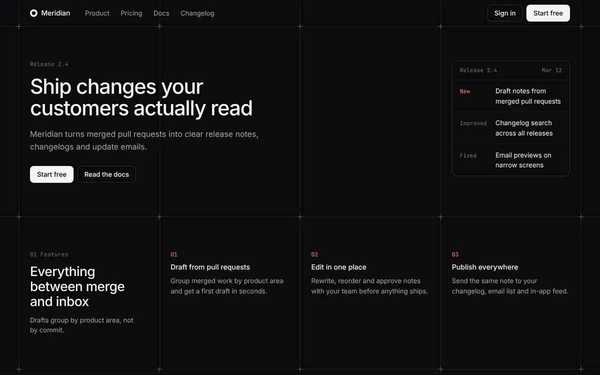
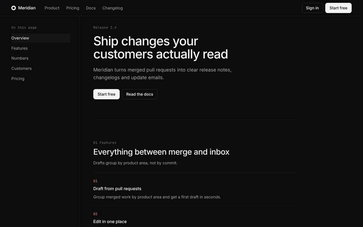
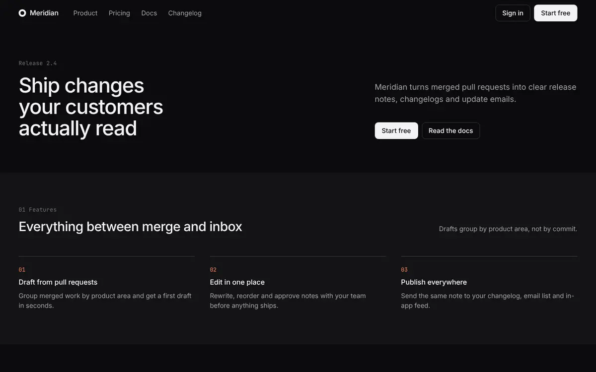
Layout pattern · Rules · Label gutter · Marketing · Docs
Ruled sections
Full-width hairlines separate every section, with a narrow label gutter on the left and the content beside it.
Rendered from the same HTML and CSS as the code below. Scroll inside the stage to see the whole page.1280 px
Anatomy. Every region, numbered.
Ruled sections build the page from horizontal bands that each end in a hairline running the full width of the viewport. A fixed label gutter on the left names the section, and the content sits in one column beside it. The rules do the separating, so there are no cards, backgrounds or shadows. It is the quiet, ledger-like structure behind many developer-tool and fintech sites.
1. Nav bar
A 56px bar with a hairline underneath. It shares the content wrapper, so the logo lines up with every label below.
2. Section
A full-width band that ends in a 1px hairline running edge to edge. The rule is the only separator between sections.
3. Label gutter
A fixed 200px column on the left holding the mono section label and, below it, one short caption.
4. Content column
Everything else sits to the right of the gutter: heading, then the section's blocks, left aligned to one edge.
5. Footer strip
The last rule closes the page. The strip reuses the wrapper, so links align with the nav.
Rules. The numbers to copy.
- Container
- Full-bleed sections, centered content wrapper
- Max width
- 1200px
- Columns
- 2: 200px label gutter and one fluid content column
- Gutter
- 32px between label and content
- Rules
- 1px solid, full-bleed, ink at 9% opacity, one per section
- Section padding
- 72px top and bottom, 48px below 800px
- Breakpoints
- Below 800px the label stacks above the content and inner columns collapse to one
- Sticky behavior
- None. The label may become position: sticky if sections are tall
- Accessibility
- Each section is a section element with a visible heading. Rules are borders, so they stay out of the accessibility tree
When to use it. And when to skip it.
Use it when
- Marketing sites for developer tools, APIs and fintech where a calm, precise tone is the point.
- Pages made of many short sections that each need a clear name.
- Pricing, changelog and about pages that read like a document.
- Sites that want structure without cards, shadows or tinted backgrounds.
Avoid it when
- Image-led or editorial pages, where hairlines compete with the pictures.
- Narrow screens only, since the label gutter has nothing to do below 800px.
- Pages with only two or three sections, which do not need this much scaffolding.
Code. The exact markup in the stage.
1<!-- data-region and data-dim only drive the Blueprint view. Remove them in production. -->2<div class="page">3 <header class="bar" data-region="Nav bar" data-n="1" data-at="bl">4 <div class="wrap">5 <nav class="nav" aria-label="Primary">6 <a class="brand" href="#"><span class="mark"></span>Meridian</a>7 <ul class="links">8 <li><a href="#">Product</a></li>9 <li><a href="#">Pricing</a></li>10 <li><a href="#">Docs</a></li>11 <li><a href="#">Changelog</a></li>12 </ul>13 <div class="actions">14 <a class="btn btn-ghost" href="#">Sign in</a>15 <a class="btn btn-primary" href="#">Start free</a>16 </div>17 </nav>18 </div>19 </header>20 <main>21 <section class="sec" data-region="Section" data-n="2" data-dim="72" data-dim-axis="pad">22 <div class="wrap grid" data-dim="max 1200">23 <div class="label" data-region="Label gutter" data-n="3">24 <p class="eyebrow">Release 2.4</p>25 </div>26 <div class="body" data-region="Content column" data-n="4">27 <h1>Ship changes your customers actually read</h1>28 <p class="lead">Meridian turns merged pull requests into clear release notes, changelogs and update emails.</p>29 <div class="actions">30 <a class="btn btn-primary" href="#">Start free</a>31 <a class="btn btn-ghost" href="#">Read the docs</a>32 </div>33 </div>34 </div>35 </section>36 <section class="sec" data-region="Section" data-dim="1px rule" data-dim-axis="tag" id="features">37 <div class="wrap grid">38 <div class="label" data-region="Label gutter">39 <p class="eyebrow">01 Features</p>40 <p class="sub">Drafts group by product area, not by commit.</p>41 </div>42 <div class="body" data-region="Content column">43 <h2>Everything between merge and inbox</h2>44 <div class="cols">45 <article class="feature">46 <span class="n">01</span>47 <h3>Draft from pull requests</h3>48 <p>Group merged work by product area and get a first draft in seconds.</p>49 </article>50 <article class="feature">51 <span class="n">02</span>52 <h3>Edit in one place</h3>53 <p>Rewrite, reorder and approve notes with your team before anything ships.</p>54 </article>55 <article class="feature">56 <span class="n">03</span>57 <h3>Publish everywhere</h3>58 <p>Send the same note to your changelog, email list and in-app feed.</p>59 </article>60 </div>61 </div>62 </div>63 </section>64 <section class="sec" data-region="Section" id="numbers">65 <div class="wrap grid">66 <div class="label" data-region="Label gutter">67 <p class="eyebrow">02 Numbers</p>68 <p class="sub">Rolling twelve month medians across all workspaces.</p>69 </div>70 <div class="body" data-region="Content column">71 <h2>Quiet, fast and always on</h2>72 <div class="cols">73 <div class="stat"><strong>2.4M</strong><span>Notes published</span></div>74 <div class="stat"><strong>99.98%</strong><span>Uptime, last 12 months</span></div>75 <div class="stat"><strong>140 ms</strong><span>Median render time</span></div>76 </div>77 </div>78 </div>79 </section>80 <section class="sec" data-region="Section" id="customers">81 <div class="wrap grid">82 <div class="label" data-region="Label gutter">83 <p class="eyebrow">03 Customers</p>84 <p class="sub">Halden, a 40 person team, publishes every week.</p>85 </div>86 <div class="body" data-region="Content column">87 <h2>In their words</h2>88 <figure class="quote">89 <blockquote>“Our changelog went from a Friday chore to the page customers open first.”</blockquote>90 <figcaption><b>Sana Okafor</b> Head of Product, Halden</figcaption>91 </figure>92 </div>93 </div>94 </section>95 <section class="sec" data-region="Section" id="pricing">96 <div class="wrap grid">97 <div class="label" data-region="Label gutter">98 <p class="eyebrow">04 Pricing</p>99 <p class="sub">Up to five people and one changelog, no card needed.</p>100 </div>101 <div class="body" data-region="Content column">102 <h2>Free for small teams</h2>103 <div class="actions">104 <a class="btn btn-primary" href="#">Start free</a>105 </div>106 </div>107 </div>108 </section>109 </main>110 <footer data-region="Footer strip" data-n="5">111 <div class="wrap">112 <div class="foot">113 <span>© 2026 Meridian</span>114 <ul>115 <li><a href="#">Privacy</a></li>116 <li><a href="#">Terms</a></li>117 <li><a href="#">Status</a></li>118 </ul>119 </div>120 </div>121 </footer>122</div>The stage renders this HTML and CSS inside the base skin. The data-region and data-dim attributes drive the Blueprint view and are safe to keep or strip. Replace the base variables with your own tokens.
The file. PATTERN.md for your agent.
1---2name: "Ruled sections"3description: "Full-width hairlines separate every section, with a narrow label gutter on the left and the content beside it."4type: pattern5tags: ["Rules", "Label gutter", "Marketing", "Docs"]6container: "Full-bleed sections, centered content wrapper"7max_width: "1200px"8columns: "2: 200px label gutter and one fluid content column"9gutter: "32px between label and content"10rules: "1px solid, full-bleed, ink at 9% opacity, one per section"11section_padding: "72px top and bottom, 48px below 800px"12breakpoints: "Below 800px the label stacks above the content and inner columns collapse to one"13sticky: "None. The label may become position: sticky if sections are tall"14---15 16# Ruled sections17 18Full-width hairlines separate every section, with a narrow label gutter on the left and the content beside it.19 20## AI build instructions21 22> Read this section before writing any code. It describes page structure only.23> Colors, type, radii and shadows come from the project's DESIGN.md, never from this file.24 25### 1. Your role26 27Build the page layout as **Ruled sections**. Use the HTML and CSS under Reference implementation as the28structural source of truth. Keep the project's own copy, components and styling, and place them into the29regions listed below. If the project has a DESIGN.md, map its tokens onto the base variables30(`--paper`, `--paper-2`, `--ink`, `--ink-2`, `--ink-3`, `--line`, `--accent`) and leave the structure CSS unchanged.31 32### 2. Structure contract33 34| Token | Value |35|-------|-------|36| container | Full-bleed sections, centered content wrapper |37| max width | 1200px |38| columns | 2: 200px label gutter and one fluid content column |39| gutter | 32px between label and content |40| rules | 1px solid, full-bleed, ink at 9% opacity, one per section |41| section padding | 72px top and bottom, 48px below 800px |42| breakpoints | Below 800px the label stacks above the content and inner columns collapse to one |43| sticky | None. The label may become position: sticky if sections are tall |44| accessibility | Each section is a section element with a visible heading. Rules are borders, so they stay out of the accessibility tree |45 46### 3. Regions47 48The markup marks each region with `data-region`. These attributes only drive the Blueprint view on49freedesignmd.com and can be removed in production.50 511. **Nav bar.** A 56px bar with a hairline underneath. It shares the content wrapper, so the logo lines up with every label below.522. **Section.** A full-width band that ends in a 1px hairline running edge to edge. The rule is the only separator between sections.533. **Label gutter.** A fixed 200px column on the left holding the mono section label and, below it, one short caption.544. **Content column.** Everything else sits to the right of the gutter: heading, then the section's blocks, left aligned to one edge.555. **Footer strip.** The last rule closes the page. The strip reuses the wrapper, so links align with the nav.56 57### 4. Rules58 59- Draw one full-bleed 1px hairline at the bottom of every section and the nav. Never use cards or shadows to separate sections.60- Keep the label gutter at 200px and align the section label to the first line of the heading.61- Use the same content wrapper (max 1200px) for nav, every section and the footer.62- Keep section padding identical across sections, 72px on desktop.63- Collapse to one column below 800px and stack the label above the content.64 65### 5. Hard constraints66 67Never do any of the following without an explicit instruction from the user:68 69- Change the structure tokens above, add a column, or add dividers the pattern does not define.70- Replace the structure with cards, shadows or colored backgrounds to separate sections.71- Use gradients, glows or emoji to decorate the layout.72- Put page content inside a region that is meant for another kind of content.73 74### 6. Before you finish, verify75 76- [ ] Every region listed above exists and is in the same order as in the reference markup.77- [ ] Container width, columns, gutter, rule weight and section padding match the contract.78- [ ] The layout collapses as described at the stated breakpoints, with no horizontal scroll at 390px.79- [ ] Sticky elements behave as stated and never cover focused content.80- [ ] Colors, type and radii were taken from DESIGN.md, not invented.81 82---83 84## Overview85 86Ruled sections build the page from horizontal bands that each end in a hairline running the full width of the viewport. A fixed label gutter on the left names the section, and the content sits in one column beside it. The rules do the separating, so there are no cards, backgrounds or shadows. It is the quiet, ledger-like structure behind many developer-tool and fintech sites.87 88## When to use it89 90- Marketing sites for developer tools, APIs and fintech where a calm, precise tone is the point.91- Pages made of many short sections that each need a clear name.92- Pricing, changelog and about pages that read like a document.93- Sites that want structure without cards, shadows or tinted backgrounds.94 95## When to avoid it96 97- Image-led or editorial pages, where hairlines compete with the pictures.98- Narrow screens only, since the label gutter has nothing to do below 800px.99- Pages with only two or three sections, which do not need this much scaffolding.100 101---102 103## Reference implementation104 105Plain HTML and CSS. The preview on freedesignmd.com renders exactly these three blocks, so what you see106is what you get. The pattern CSS decides structure. The base CSS is the neutral skin shared by every107pattern: replace its variables with your DESIGN.md tokens and keep the names.108 109### HTML110 111```html112<!-- data-region and data-dim only drive the Blueprint view. Remove them in production. -->113<div class="page">114 <header class="bar" data-region="Nav bar" data-n="1" data-at="bl">115 <div class="wrap">116 <nav class="nav" aria-label="Primary">117 <a class="brand" href="#"><span class="mark"></span>Meridian</a>118 <ul class="links">119 <li><a href="#">Product</a></li>120 <li><a href="#">Pricing</a></li>121 <li><a href="#">Docs</a></li>122 <li><a href="#">Changelog</a></li>123 </ul>124 <div class="actions">125 <a class="btn btn-ghost" href="#">Sign in</a>126 <a class="btn btn-primary" href="#">Start free</a>127 </div>128 </nav>129 </div>130 </header>131 <main>132 <section class="sec" data-region="Section" data-n="2" data-dim="72" data-dim-axis="pad">133 <div class="wrap grid" data-dim="max 1200">134 <div class="label" data-region="Label gutter" data-n="3">135 <p class="eyebrow">Release 2.4</p>136 </div>137 <div class="body" data-region="Content column" data-n="4">138 <h1>Ship changes your customers actually read</h1>139 <p class="lead">Meridian turns merged pull requests into clear release notes, changelogs and update emails.</p>140 <div class="actions">141 <a class="btn btn-primary" href="#">Start free</a>142 <a class="btn btn-ghost" href="#">Read the docs</a>143 </div>144 </div>145 </div>146 </section>147 <section class="sec" data-region="Section" data-dim="1px rule" data-dim-axis="tag" id="features">148 <div class="wrap grid">149 <div class="label" data-region="Label gutter">150 <p class="eyebrow">01 Features</p>151 <p class="sub">Drafts group by product area, not by commit.</p>152 </div>153 <div class="body" data-region="Content column">154 <h2>Everything between merge and inbox</h2>155 <div class="cols">156 <article class="feature">157 <span class="n">01</span>158 <h3>Draft from pull requests</h3>159 <p>Group merged work by product area and get a first draft in seconds.</p>160 </article>161 <article class="feature">162 <span class="n">02</span>163 <h3>Edit in one place</h3>164 <p>Rewrite, reorder and approve notes with your team before anything ships.</p>165 </article>166 <article class="feature">167 <span class="n">03</span>168 <h3>Publish everywhere</h3>169 <p>Send the same note to your changelog, email list and in-app feed.</p>170 </article>171 </div>172 </div>173 </div>174 </section>175 <section class="sec" data-region="Section" id="numbers">176 <div class="wrap grid">177 <div class="label" data-region="Label gutter">178 <p class="eyebrow">02 Numbers</p>179 <p class="sub">Rolling twelve month medians across all workspaces.</p>180 </div>181 <div class="body" data-region="Content column">182 <h2>Quiet, fast and always on</h2>183 <div class="cols">184 <div class="stat"><strong>2.4M</strong><span>Notes published</span></div>185 <div class="stat"><strong>99.98%</strong><span>Uptime, last 12 months</span></div>186 <div class="stat"><strong>140 ms</strong><span>Median render time</span></div>187 </div>188 </div>189 </div>190 </section>191 <section class="sec" data-region="Section" id="customers">192 <div class="wrap grid">193 <div class="label" data-region="Label gutter">194 <p class="eyebrow">03 Customers</p>195 <p class="sub">Halden, a 40 person team, publishes every week.</p>196 </div>197 <div class="body" data-region="Content column">198 <h2>In their words</h2>199 <figure class="quote">200 <blockquote>“Our changelog went from a Friday chore to the page customers open first.”</blockquote>201 <figcaption><b>Sana Okafor</b> Head of Product, Halden</figcaption>202 </figure>203 </div>204 </div>205 </section>206 <section class="sec" data-region="Section" id="pricing">207 <div class="wrap grid">208 <div class="label" data-region="Label gutter">209 <p class="eyebrow">04 Pricing</p>210 <p class="sub">Up to five people and one changelog, no card needed.</p>211 </div>212 <div class="body" data-region="Content column">213 <h2>Free for small teams</h2>214 <div class="actions">215 <a class="btn btn-primary" href="#">Start free</a>216 </div>217 </div>218 </div>219 </section>220 </main>221 <footer data-region="Footer strip" data-n="5">222 <div class="wrap">223 <div class="foot">224 <span>© 2026 Meridian</span>225 <ul>226 <li><a href="#">Privacy</a></li>227 <li><a href="#">Terms</a></li>228 <li><a href="#">Status</a></li>229 </ul>230 </div>231 </div>232 </footer>233</div>234```235 236### CSS (pattern)237 238```css239:root {240 --max: 1200px; /* content width */241 --label: 200px; /* label gutter */242 --gap: 32px; /* gutter between label and content */243 --pad: 72px; /* section padding, top and bottom */244 --rule: 1px solid var(--line);245}246 247.wrap { width: min(100% - 48px, var(--max)); margin-inline: auto; }248.bar { border-bottom: var(--rule); }249 250/* Every section ends in a full-bleed hairline. The rule is the separator. */251.sec { padding-block: var(--pad); border-bottom: var(--rule); }252.grid { display: grid; grid-template-columns: var(--label) minmax(0, 1fr); gap: var(--gap); }253 254.label { display: flex; flex-direction: column; gap: 12px; padding-top: 6px; }255.body > * + * { margin-top: 24px; }256.body > h2 + * { margin-top: 40px; }257.body > .lead { margin-top: 20px; }258.cols { display: grid; grid-template-columns: repeat(3, minmax(0, 1fr)); gap: 32px; }259 260footer { border-top: 0; }261 262@media (max-width: 800px) {263 :root { --pad: 48px; }264 .grid { grid-template-columns: 1fr; gap: 16px; }265 .label { padding-top: 0; }266 .cols { grid-template-columns: 1fr; gap: 24px; }267}268```269 270### CSS (base, shared by every pattern)271 272```css273/* Base: tokens and content blocks shared by every pattern. Structure lives in the pattern CSS. */274:root {275 color-scheme: light;276 --paper: #ffffff;277 --paper-2: #f5f5f6;278 --ink: #0e0e10;279 --ink-2: #55555c;280 --ink-3: #767680;281 --line: rgba(14, 14, 16, 0.09);282 --line-strong: rgba(14, 14, 16, 0.16);283 --accent: #c8421a;284 --inv-paper: #0b0b0d;285 --inv-ink: #f3f3f5;286 --inv-ink-2: #a4a4ab;287 --inv-line: rgba(255, 255, 255, 0.12);288 --font: "Inter Variable", Inter, ui-sans-serif, system-ui, -apple-system, "Segoe UI", sans-serif;289 --mono: "JetBrains Mono Variable", "JetBrains Mono", ui-monospace, "SF Mono", Menlo, monospace;290}291:root[data-theme="dark"] {292 color-scheme: dark;293 --paper: #0b0b0d;294 --paper-2: #131316;295 --ink: #f3f3f5;296 --ink-2: #a4a4ab;297 --ink-3: #74747c;298 --line: rgba(255, 255, 255, 0.09);299 --line-strong: rgba(255, 255, 255, 0.16);300 --accent: #ff8a5c;301 --inv-paper: #f6f6f7;302 --inv-ink: #0e0e10;303 --inv-ink-2: #55555c;304 --inv-line: rgba(14, 14, 16, 0.1);305}306 307*, *::before, *::after { box-sizing: border-box; }308html { -webkit-text-size-adjust: 100%; }309body {310 margin: 0;311 background: var(--paper);312 color: var(--ink);313 font: 400 15px/1.55 var(--font);314 -webkit-font-smoothing: antialiased;315}316h1, h2, h3, p, ul, ol, figure, blockquote, dl, dd { margin: 0; }317ul, ol { padding: 0; list-style: none; }318a { color: inherit; text-decoration: none; }319 320/* Type scale: 12 / 13 / 15 / 17 / 22 / 28 / 44 */321h1, .t-h1 { font-size: 44px; line-height: 1.05; letter-spacing: -0.03em; font-weight: 500; text-wrap: balance; }322h2, .t-h2 { font-size: 28px; line-height: 1.15; letter-spacing: -0.02em; font-weight: 500; text-wrap: balance; }323h3 { font-size: 15px; line-height: 1.4; font-weight: 500; }324.lead { font-size: 17px; line-height: 1.55; color: var(--ink-2); max-width: 46ch; text-wrap: pretty; }325.sub { font-size: 14px; line-height: 1.55; color: var(--ink-2); max-width: 40ch; text-wrap: pretty; }326.eyebrow { font: 400 12px/16px var(--mono); color: var(--ink-3); letter-spacing: 0.02em; }327 328/* Buttons: one primary per view */329.actions { display: flex; flex-wrap: wrap; align-items: center; gap: 8px; }330.btn {331 display: inline-flex; align-items: center; height: 36px; padding: 0 14px;332 border: 1px solid transparent; border-radius: 8px;333 font: 500 14px/1 var(--font); white-space: nowrap;334}335.btn-primary { background: var(--ink); color: var(--paper); }336.btn-ghost { border-color: var(--line-strong); color: var(--ink); }337 338/* Nav */339.nav { display: flex; align-items: center; gap: 32px; height: 56px; }340.brand { display: inline-flex; align-items: center; gap: 8px; font-weight: 500; letter-spacing: -0.01em; }341.mark { width: 16px; height: 16px; border: 4px solid var(--ink); border-radius: 50%; }342.links { display: flex; gap: 24px; font-size: 14px; color: var(--ink-2); }343.nav .actions { margin-left: auto; }344 345/* Feature */346.feature { display: flex; flex-direction: column; gap: 8px; }347.feature .n { font: 400 12px/16px var(--mono); color: var(--accent); }348.feature p { font-size: 14px; line-height: 1.55; color: var(--ink-2); }349 350/* Stat */351.stat strong {352 display: block; font: 500 36px/1.1 var(--font); letter-spacing: -0.03em;353 font-variant-numeric: tabular-nums;354}355.stat span { display: block; margin-top: 4px; font-size: 13px; color: var(--ink-2); }356 357/* Quote */358.quote blockquote { font-size: 22px; line-height: 1.35; letter-spacing: -0.015em; text-wrap: balance; }359.quote figcaption { margin-top: 16px; font-size: 13px; color: var(--ink-2); }360.quote figcaption b { color: var(--ink); font-weight: 500; }361 362/* Release card: the one visual used when a pattern has a media slot */363.mock { border: 1px solid var(--line-strong); border-radius: 12px; background: var(--paper); overflow: hidden; }364.mock-bar { display: flex; justify-content: space-between; padding: 12px 16px; border-bottom: 1px solid var(--line); font: 400 12px/16px var(--mono); color: var(--ink-3); }365.mock li { display: flex; gap: 12px; align-items: baseline; padding: 12px 16px; border-bottom: 1px solid var(--line); font-size: 14px; }366.mock li:last-child { border-bottom: 0; }367.mock li b { flex: none; width: 64px; font: 400 12px/16px var(--mono); color: var(--ink-3); }368.mock li b.new { color: var(--accent); }369 370/* Footer strip */371.foot { display: flex; align-items: center; justify-content: space-between; gap: 16px; height: 56px; font-size: 13px; color: var(--ink-3); }372.foot ul { display: flex; gap: 20px; }373 374/* Inverted band: swaps the tokens, so every block inside adapts */375.inv {376 --paper: var(--inv-paper); --ink: var(--inv-ink); --ink-2: var(--inv-ink-2);377 --ink-3: var(--inv-ink-2); --line: var(--inv-line); --line-strong: var(--inv-line);378 background: var(--paper); color: var(--ink);379}380 381@media (max-width: 640px) {382 h1, .t-h1 { font-size: 34px; }383 h2, .t-h2 { font-size: 24px; }384 .links, .nav .btn-ghost { display: none; }385 .nav { gap: 16px; }386 .foot ul { gap: 14px; }387}388 389```Save it next to your DESIGN.md and tell your agent: build every page with PATTERN.md for structure and DESIGN.md for look.