Layout pattern · Sidebar · Dashboard · Product UI · Admin
App shell
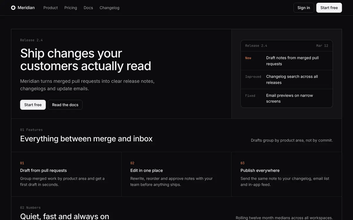
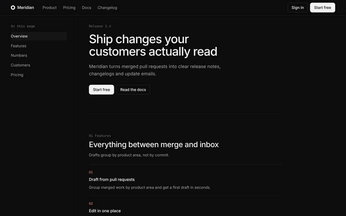
A fixed sidebar and top bar around one scrolling content area, with bordered panels on a 12-column grid.
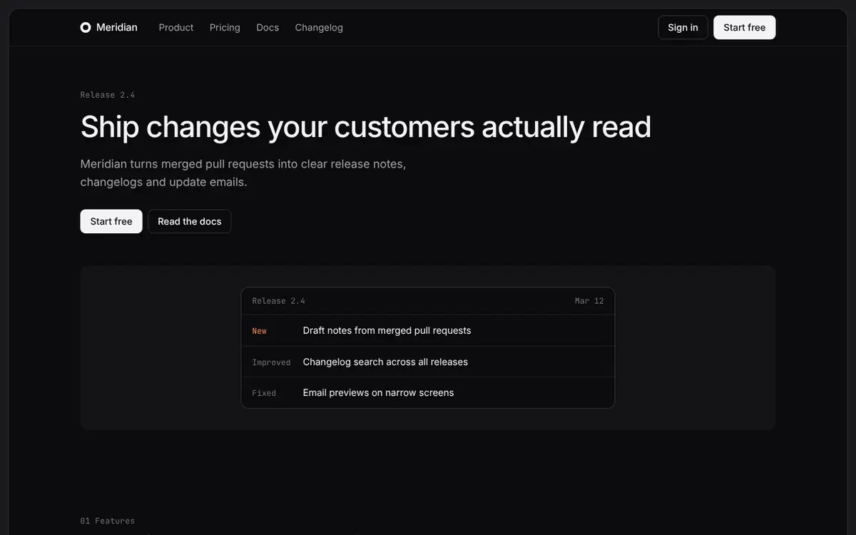
Rendered from the same HTML and CSS as the code below. Scroll inside the stage to see the whole page.1280 px
Anatomy. Every region, numbered.
The structure of a product, not a website. A fixed sidebar carries navigation, a fixed top bar carries context and actions, and a single content area scrolls between them. Content is arranged in bordered panels on a 12-column grid. Because everything except the content is pinned, users never lose their place, and the same shell can host any number of screens.
1. Sidebar
A 232px column with the brand, the primary navigation and the page index. It has its own scroll and is never pushed by the content.
2. Top bar
A 48px bar over the content area: breadcrumb on the left, actions on the right. It stays fixed.
3. Content area
The only region that scrolls. 32px of padding and a fluid width, capped so panels stay readable.
4. Panel
Content comes in bordered panels with an 8px radius on a 12-column grid with a 16px gap. Panels span 5, 7 or 12 columns.
5. Status strip
A 40px strip pinned to the bottom of the content area for footer links.
Rules. The numbers to copy.
- Container
- Full viewport shell: grid of sidebar and content area, 100svh tall
- Max width
- Fluid. Keep text blocks at 720px or less
- Columns
- Shell: 232px sidebar and fluid area. Panels: 12 columns, spans of 5, 7 or 12
- Gutter
- 16px between panels
- Rules
- 1px solid, ink at 9% opacity, between sidebar, bar, content and status strip
- Section padding
- 32px content padding, 24px inside panels, 20px below 800px
- Breakpoints
- Below 800px the sidebar becomes a horizontal strip above the content and panels stack
- Sticky behavior
- Sidebar, top bar and status strip are pinned by the shell. Only the content area scrolls
- Accessibility
- Sidebar is a nav landmark with aria-current on the active page, the content area is the main landmark, and focus order is sidebar, bar, content
When to use it. And when to skip it.
Use it when
- Dashboards, admin tools and settings screens.
- Product UIs with many screens that share navigation.
- Documentation or marketing pages that want to feel like the product itself.
- Anything where context and navigation must stay visible while content scrolls.
Avoid it when
- Marketing pages for first-time visitors, where a sidebar adds friction.
- Small-screen-first products, since the shell is built for desktop widths.
- Single-screen tools with no navigation.
Code. The exact markup in the stage.
1<!-- data-region and data-dim only drive the Blueprint view. Remove them in production. -->2<div class="app">3 <aside class="side" data-region="Sidebar" data-n="1" data-at="in" data-dim="232" data-dim-axis="tag" data-dim-at="in">4 <a class="brand" href="#"><span class="mark"></span>Meridian</a>5 <nav aria-label="Primary">6 <ul class="menu">7 <li><a href="#" class="on" aria-current="page">Product</a></li>8 <li><a href="#">Pricing</a></li>9 <li><a href="#">Docs</a></li>10 <li><a href="#">Changelog</a></li>11 </ul>12 </nav>13 <p class="eyebrow">On this page</p>14 <ul class="menu">15 <li><a href="#features">Features</a></li>16 <li><a href="#numbers">Numbers</a></li>17 <li><a href="#customers">Customers</a></li>18 <li><a href="#pricing">Pricing</a></li>19 </ul>20 </aside>21 <div class="area">22 <header class="top" data-region="Top bar" data-n="2" data-at="in" data-dim="48" data-dim-axis="tag" data-dim-at="in">23 <span class="eyebrow">Meridian / Release 2.4</span>24 <div class="actions">25 <a class="btn btn-ghost" href="#">Sign in</a>26 <a class="btn btn-primary" href="#">Start free</a>27 </div>28 </header>29 <main class="content" data-region="Content area" data-n="3" data-at="in" data-dim="32" data-dim-axis="pad">30 <div class="page-head">31 <p class="eyebrow">Release 2.4</p>32 <h1>Ship changes your customers actually read</h1>33 <p class="lead">Meridian turns merged pull requests into clear release notes, changelogs and update emails.</p>34 <div class="actions">35 <a class="btn btn-primary" href="#">Start free</a>36 <a class="btn btn-ghost" href="#">Read the docs</a>37 </div>38 </div>39 <div class="panels" data-dim="gap 16" data-dim-axis="tag" data-dim-at="in">40 <section class="panel p-12" data-region="Panel" data-n="4">41 <header class="panel-head">42 <div>43 <p class="eyebrow">01 Features</p>44 <h2>Everything between merge and inbox</h2>45 </div>46 <p class="sub">Drafts group by product area, not by commit.</p>47 </header>48 <div class="cols">49 <article class="feature">50 <span class="n">01</span>51 <h3>Draft from pull requests</h3>52 <p>Group merged work by product area and get a first draft in seconds.</p>53 </article>54 <article class="feature">55 <span class="n">02</span>56 <h3>Edit in one place</h3>57 <p>Rewrite, reorder and approve notes with your team before anything ships.</p>58 </article>59 <article class="feature">60 <span class="n">03</span>61 <h3>Publish everywhere</h3>62 <p>Send the same note to your changelog, email list and in-app feed.</p>63 </article>64 </div>65 </section>66 <section class="panel p-12" data-region="Panel">67 <header class="panel-head">68 <div>69 <p class="eyebrow">02 Numbers</p>70 <h2>Quiet, fast and always on</h2>71 </div>72 <p class="sub">Rolling twelve month medians across all workspaces.</p>73 </header>74 <div class="cols">75 <div class="stat"><strong>2.4M</strong><span>Notes published</span></div>76 <div class="stat"><strong>99.98%</strong><span>Uptime, last 12 months</span></div>77 <div class="stat"><strong>140 ms</strong><span>Median render time</span></div>78 </div>79 </section>80 <section class="panel p-7" data-region="Panel">81 <header class="panel-head">82 <div>83 <p class="eyebrow">03 Customers</p>84 <h2>In their words</h2>85 </div>86 <p class="sub">Halden, a 40 person team, publishes every week.</p>87 </header>88 <figure class="quote">89 <blockquote>“Our changelog went from a Friday chore to the page customers open first.”</blockquote>90 <figcaption><b>Sana Okafor</b> Head of Product, Halden</figcaption>91 </figure>92 </section>93 <section class="panel p-5" data-region="Panel">94 <header class="panel-head">95 <div>96 <p class="eyebrow">04 Pricing</p>97 <h2>Free for small teams</h2>98 </div>99 <p class="sub">Up to five people and one changelog, no card needed.</p>100 </header>101 <div class="actions">102 <a class="btn btn-primary" href="#">Start free</a>103 </div>104 </section>105 </div>106 </main>107 <footer class="status" data-region="Status strip" data-n="5" data-at="in">108 <div class="foot">109 <span>© 2026 Meridian</span>110 <ul>111 <li><a href="#">Privacy</a></li>112 <li><a href="#">Terms</a></li>113 <li><a href="#">Status</a></li>114 </ul>115 </div>116 </footer>117 </div>118</div>The stage renders this HTML and CSS inside the base skin. The data-region and data-dim attributes drive the Blueprint view and are safe to keep or strip. Replace the base variables with your own tokens.
The file. PATTERN.md for your agent.
1---2name: "App shell"3description: "A fixed sidebar and top bar around one scrolling content area, with bordered panels on a 12-column grid."4type: pattern5tags: ["Sidebar", "Dashboard", "Product UI", "Admin"]6container: "Full viewport shell: grid of sidebar and content area, 100svh tall"7max_width: "Fluid. Keep text blocks at 720px or less"8columns: "Shell: 232px sidebar and fluid area. Panels: 12 columns, spans of 5, 7 or 12"9gutter: "16px between panels"10rules: "1px solid, ink at 9% opacity, between sidebar, bar, content and status strip"11section_padding: "32px content padding, 24px inside panels, 20px below 800px"12breakpoints: "Below 800px the sidebar becomes a horizontal strip above the content and panels stack"13sticky: "Sidebar, top bar and status strip are pinned by the shell. Only the content area scrolls"14---15 16# App shell17 18A fixed sidebar and top bar around one scrolling content area, with bordered panels on a 12-column grid.19 20## AI build instructions21 22> Read this section before writing any code. It describes page structure only.23> Colors, type, radii and shadows come from the project's DESIGN.md, never from this file.24 25### 1. Your role26 27Build the page layout as **App shell**. Use the HTML and CSS under Reference implementation as the28structural source of truth. Keep the project's own copy, components and styling, and place them into the29regions listed below. If the project has a DESIGN.md, map its tokens onto the base variables30(`--paper`, `--paper-2`, `--ink`, `--ink-2`, `--ink-3`, `--line`, `--accent`) and leave the structure CSS unchanged.31 32### 2. Structure contract33 34| Token | Value |35|-------|-------|36| container | Full viewport shell: grid of sidebar and content area, 100svh tall |37| max width | Fluid. Keep text blocks at 720px or less |38| columns | Shell: 232px sidebar and fluid area. Panels: 12 columns, spans of 5, 7 or 12 |39| gutter | 16px between panels |40| rules | 1px solid, ink at 9% opacity, between sidebar, bar, content and status strip |41| section padding | 32px content padding, 24px inside panels, 20px below 800px |42| breakpoints | Below 800px the sidebar becomes a horizontal strip above the content and panels stack |43| sticky | Sidebar, top bar and status strip are pinned by the shell. Only the content area scrolls |44| accessibility | Sidebar is a nav landmark with aria-current on the active page, the content area is the main landmark, and focus order is sidebar, bar, content |45 46### 3. Regions47 48The markup marks each region with `data-region`. These attributes only drive the Blueprint view on49freedesignmd.com and can be removed in production.50 511. **Sidebar.** A 232px column with the brand, the primary navigation and the page index. It has its own scroll and is never pushed by the content.522. **Top bar.** A 48px bar over the content area: breadcrumb on the left, actions on the right. It stays fixed.533. **Content area.** The only region that scrolls. 32px of padding and a fluid width, capped so panels stay readable.544. **Panel.** Content comes in bordered panels with an 8px radius on a 12-column grid with a 16px gap. Panels span 5, 7 or 12 columns.555. **Status strip.** A 40px strip pinned to the bottom of the content area for footer links.56 57### 4. Rules58 59- Make the shell exactly viewport height with a 232px sidebar. Only the content area scrolls.60- Pin the top bar at 48px and the status strip at 40px.61- Arrange content in bordered panels on a 12-column grid with a 16px gap. Panels span 5, 7 or 12.62- Mark the active sidebar item with aria-current and a surface step, never a color fill.63- Below 800px turn the sidebar into a horizontal strip and let the page scroll normally.64 65### 5. Hard constraints66 67Never do any of the following without an explicit instruction from the user:68 69- Change the structure tokens above, add a column, or add dividers the pattern does not define.70- Replace the structure with cards, shadows or colored backgrounds to separate sections.71- Use gradients, glows or emoji to decorate the layout.72- Put page content inside a region that is meant for another kind of content.73 74### 6. Before you finish, verify75 76- [ ] Every region listed above exists and is in the same order as in the reference markup.77- [ ] Container width, columns, gutter, rule weight and section padding match the contract.78- [ ] The layout collapses as described at the stated breakpoints, with no horizontal scroll at 390px.79- [ ] Sticky elements behave as stated and never cover focused content.80- [ ] Colors, type and radii were taken from DESIGN.md, not invented.81 82---83 84## Overview85 86The structure of a product, not a website. A fixed sidebar carries navigation, a fixed top bar carries context and actions, and a single content area scrolls between them. Content is arranged in bordered panels on a 12-column grid. Because everything except the content is pinned, users never lose their place, and the same shell can host any number of screens.87 88## When to use it89 90- Dashboards, admin tools and settings screens.91- Product UIs with many screens that share navigation.92- Documentation or marketing pages that want to feel like the product itself.93- Anything where context and navigation must stay visible while content scrolls.94 95## When to avoid it96 97- Marketing pages for first-time visitors, where a sidebar adds friction.98- Small-screen-first products, since the shell is built for desktop widths.99- Single-screen tools with no navigation.100 101---102 103## Reference implementation104 105Plain HTML and CSS. The preview on freedesignmd.com renders exactly these three blocks, so what you see106is what you get. The pattern CSS decides structure. The base CSS is the neutral skin shared by every107pattern: replace its variables with your DESIGN.md tokens and keep the names.108 109### HTML110 111```html112<!-- data-region and data-dim only drive the Blueprint view. Remove them in production. -->113<div class="app">114 <aside class="side" data-region="Sidebar" data-n="1" data-at="in" data-dim="232" data-dim-axis="tag" data-dim-at="in">115 <a class="brand" href="#"><span class="mark"></span>Meridian</a>116 <nav aria-label="Primary">117 <ul class="menu">118 <li><a href="#" class="on" aria-current="page">Product</a></li>119 <li><a href="#">Pricing</a></li>120 <li><a href="#">Docs</a></li>121 <li><a href="#">Changelog</a></li>122 </ul>123 </nav>124 <p class="eyebrow">On this page</p>125 <ul class="menu">126 <li><a href="#features">Features</a></li>127 <li><a href="#numbers">Numbers</a></li>128 <li><a href="#customers">Customers</a></li>129 <li><a href="#pricing">Pricing</a></li>130 </ul>131 </aside>132 <div class="area">133 <header class="top" data-region="Top bar" data-n="2" data-at="in" data-dim="48" data-dim-axis="tag" data-dim-at="in">134 <span class="eyebrow">Meridian / Release 2.4</span>135 <div class="actions">136 <a class="btn btn-ghost" href="#">Sign in</a>137 <a class="btn btn-primary" href="#">Start free</a>138 </div>139 </header>140 <main class="content" data-region="Content area" data-n="3" data-at="in" data-dim="32" data-dim-axis="pad">141 <div class="page-head">142 <p class="eyebrow">Release 2.4</p>143 <h1>Ship changes your customers actually read</h1>144 <p class="lead">Meridian turns merged pull requests into clear release notes, changelogs and update emails.</p>145 <div class="actions">146 <a class="btn btn-primary" href="#">Start free</a>147 <a class="btn btn-ghost" href="#">Read the docs</a>148 </div>149 </div>150 <div class="panels" data-dim="gap 16" data-dim-axis="tag" data-dim-at="in">151 <section class="panel p-12" data-region="Panel" data-n="4">152 <header class="panel-head">153 <div>154 <p class="eyebrow">01 Features</p>155 <h2>Everything between merge and inbox</h2>156 </div>157 <p class="sub">Drafts group by product area, not by commit.</p>158 </header>159 <div class="cols">160 <article class="feature">161 <span class="n">01</span>162 <h3>Draft from pull requests</h3>163 <p>Group merged work by product area and get a first draft in seconds.</p>164 </article>165 <article class="feature">166 <span class="n">02</span>167 <h3>Edit in one place</h3>168 <p>Rewrite, reorder and approve notes with your team before anything ships.</p>169 </article>170 <article class="feature">171 <span class="n">03</span>172 <h3>Publish everywhere</h3>173 <p>Send the same note to your changelog, email list and in-app feed.</p>174 </article>175 </div>176 </section>177 <section class="panel p-12" data-region="Panel">178 <header class="panel-head">179 <div>180 <p class="eyebrow">02 Numbers</p>181 <h2>Quiet, fast and always on</h2>182 </div>183 <p class="sub">Rolling twelve month medians across all workspaces.</p>184 </header>185 <div class="cols">186 <div class="stat"><strong>2.4M</strong><span>Notes published</span></div>187 <div class="stat"><strong>99.98%</strong><span>Uptime, last 12 months</span></div>188 <div class="stat"><strong>140 ms</strong><span>Median render time</span></div>189 </div>190 </section>191 <section class="panel p-7" data-region="Panel">192 <header class="panel-head">193 <div>194 <p class="eyebrow">03 Customers</p>195 <h2>In their words</h2>196 </div>197 <p class="sub">Halden, a 40 person team, publishes every week.</p>198 </header>199 <figure class="quote">200 <blockquote>“Our changelog went from a Friday chore to the page customers open first.”</blockquote>201 <figcaption><b>Sana Okafor</b> Head of Product, Halden</figcaption>202 </figure>203 </section>204 <section class="panel p-5" data-region="Panel">205 <header class="panel-head">206 <div>207 <p class="eyebrow">04 Pricing</p>208 <h2>Free for small teams</h2>209 </div>210 <p class="sub">Up to five people and one changelog, no card needed.</p>211 </header>212 <div class="actions">213 <a class="btn btn-primary" href="#">Start free</a>214 </div>215 </section>216 </div>217 </main>218 <footer class="status" data-region="Status strip" data-n="5" data-at="in">219 <div class="foot">220 <span>© 2026 Meridian</span>221 <ul>222 <li><a href="#">Privacy</a></li>223 <li><a href="#">Terms</a></li>224 <li><a href="#">Status</a></li>225 </ul>226 </div>227 </footer>228 </div>229</div>230```231 232### CSS (pattern)233 234```css235:root {236 --side: 232px; /* sidebar */237 --bar: 48px; /* top bar */238 --status: 40px; /* status strip */239 --pad: 32px; /* content padding */240 --gap: 16px; /* panel gap */241}242 243/* The shell fills the viewport. Only .content scrolls. */244.app { display: grid; grid-template-columns: var(--side) minmax(0, 1fr); height: 100svh; }245.side { display: flex; flex-direction: column; gap: 16px; padding: 16px 12px; overflow: auto; border-right: 1px solid var(--line); background: var(--paper-2); }246.side .brand { padding: 0 8px; height: 32px; }247.side .eyebrow { margin-top: 8px; padding: 0 8px; }248.menu { display: grid; gap: 2px; }249.menu a { display: block; padding: 6px 8px; border-radius: 6px; font-size: 14px; color: var(--ink-2); }250.menu a:hover { color: var(--ink); }251.menu a.on { background: var(--paper); box-shadow: 0 0 0 1px var(--line); color: var(--ink); }252 253.area { display: flex; flex-direction: column; min-width: 0; min-height: 0; }254.top { flex: none; display: flex; align-items: center; justify-content: space-between; height: var(--bar); padding-inline: var(--pad); border-bottom: 1px solid var(--line); }255.top .btn { height: 32px; }256.content { flex: 1; min-height: 0; overflow: auto; padding: var(--pad); }257.status { flex: none; height: var(--status); padding-inline: var(--pad); border-top: 1px solid var(--line); }258.status .foot { height: 100%; }259 260.page-head { max-width: 720px; }261.page-head > * + * { margin-top: 12px; }262.page-head > h1 { margin-top: 12px; font-size: 28px; line-height: 1.15; letter-spacing: -0.02em; }263.page-head > .lead { font-size: 15px; }264.page-head > .actions { margin-top: 20px; }265 266.panels { display: grid; grid-template-columns: repeat(12, minmax(0, 1fr)); gap: var(--gap); margin-top: 32px; }267.panel { min-width: 0; padding: 24px; border: 1px solid var(--line); border-radius: 8px; background: var(--paper); }268.p-12 { grid-column: span 12; }269.p-7 { grid-column: span 7; }270.p-5 { grid-column: span 5; }271.panel-head { display: flex; align-items: flex-end; justify-content: space-between; gap: 24px; margin-bottom: 20px; }272.panel-head > div > * + * { margin-top: 6px; }273.panel-head h2 { font-size: 17px; line-height: 1.3; letter-spacing: -0.01em; }274.panel-head .sub { text-align: right; font-size: 13px; }275.p-7 .panel-head, .p-5 .panel-head { flex-direction: column; align-items: flex-start; gap: 6px; }276.p-7 .panel-head .sub, .p-5 .panel-head .sub { text-align: left; }277.panel .quote blockquote { font-size: 17px; line-height: 1.45; }278.panel .stat strong { font-size: 28px; }279.cols { display: grid; grid-template-columns: repeat(3, minmax(0, 1fr)); gap: 24px; }280 281@media (max-width: 800px) {282 :root { --pad: 20px; }283 .app { display: block; height: auto; }284 .side { flex-direction: row; align-items: center; gap: 4px; padding: 8px 12px; border-right: 0; border-bottom: 1px solid var(--line); overflow-x: auto; }285 .side .eyebrow, .side .menu + .menu { display: none; }286 .side .menu { display: flex; }287 .content { overflow: visible; }288 .p-12, .p-7, .p-5 { grid-column: span 12; }289 .cols { grid-template-columns: 1fr; }290 .panel-head { flex-direction: column; align-items: flex-start; gap: 6px; }291 .panel-head .sub { text-align: left; }292}293```294 295### CSS (base, shared by every pattern)296 297```css298/* Base: tokens and content blocks shared by every pattern. Structure lives in the pattern CSS. */299:root {300 color-scheme: light;301 --paper: #ffffff;302 --paper-2: #f5f5f6;303 --ink: #0e0e10;304 --ink-2: #55555c;305 --ink-3: #767680;306 --line: rgba(14, 14, 16, 0.09);307 --line-strong: rgba(14, 14, 16, 0.16);308 --accent: #c8421a;309 --inv-paper: #0b0b0d;310 --inv-ink: #f3f3f5;311 --inv-ink-2: #a4a4ab;312 --inv-line: rgba(255, 255, 255, 0.12);313 --font: "Inter Variable", Inter, ui-sans-serif, system-ui, -apple-system, "Segoe UI", sans-serif;314 --mono: "JetBrains Mono Variable", "JetBrains Mono", ui-monospace, "SF Mono", Menlo, monospace;315}316:root[data-theme="dark"] {317 color-scheme: dark;318 --paper: #0b0b0d;319 --paper-2: #131316;320 --ink: #f3f3f5;321 --ink-2: #a4a4ab;322 --ink-3: #74747c;323 --line: rgba(255, 255, 255, 0.09);324 --line-strong: rgba(255, 255, 255, 0.16);325 --accent: #ff8a5c;326 --inv-paper: #f6f6f7;327 --inv-ink: #0e0e10;328 --inv-ink-2: #55555c;329 --inv-line: rgba(14, 14, 16, 0.1);330}331 332*, *::before, *::after { box-sizing: border-box; }333html { -webkit-text-size-adjust: 100%; }334body {335 margin: 0;336 background: var(--paper);337 color: var(--ink);338 font: 400 15px/1.55 var(--font);339 -webkit-font-smoothing: antialiased;340}341h1, h2, h3, p, ul, ol, figure, blockquote, dl, dd { margin: 0; }342ul, ol { padding: 0; list-style: none; }343a { color: inherit; text-decoration: none; }344 345/* Type scale: 12 / 13 / 15 / 17 / 22 / 28 / 44 */346h1, .t-h1 { font-size: 44px; line-height: 1.05; letter-spacing: -0.03em; font-weight: 500; text-wrap: balance; }347h2, .t-h2 { font-size: 28px; line-height: 1.15; letter-spacing: -0.02em; font-weight: 500; text-wrap: balance; }348h3 { font-size: 15px; line-height: 1.4; font-weight: 500; }349.lead { font-size: 17px; line-height: 1.55; color: var(--ink-2); max-width: 46ch; text-wrap: pretty; }350.sub { font-size: 14px; line-height: 1.55; color: var(--ink-2); max-width: 40ch; text-wrap: pretty; }351.eyebrow { font: 400 12px/16px var(--mono); color: var(--ink-3); letter-spacing: 0.02em; }352 353/* Buttons: one primary per view */354.actions { display: flex; flex-wrap: wrap; align-items: center; gap: 8px; }355.btn {356 display: inline-flex; align-items: center; height: 36px; padding: 0 14px;357 border: 1px solid transparent; border-radius: 8px;358 font: 500 14px/1 var(--font); white-space: nowrap;359}360.btn-primary { background: var(--ink); color: var(--paper); }361.btn-ghost { border-color: var(--line-strong); color: var(--ink); }362 363/* Nav */364.nav { display: flex; align-items: center; gap: 32px; height: 56px; }365.brand { display: inline-flex; align-items: center; gap: 8px; font-weight: 500; letter-spacing: -0.01em; }366.mark { width: 16px; height: 16px; border: 4px solid var(--ink); border-radius: 50%; }367.links { display: flex; gap: 24px; font-size: 14px; color: var(--ink-2); }368.nav .actions { margin-left: auto; }369 370/* Feature */371.feature { display: flex; flex-direction: column; gap: 8px; }372.feature .n { font: 400 12px/16px var(--mono); color: var(--accent); }373.feature p { font-size: 14px; line-height: 1.55; color: var(--ink-2); }374 375/* Stat */376.stat strong {377 display: block; font: 500 36px/1.1 var(--font); letter-spacing: -0.03em;378 font-variant-numeric: tabular-nums;379}380.stat span { display: block; margin-top: 4px; font-size: 13px; color: var(--ink-2); }381 382/* Quote */383.quote blockquote { font-size: 22px; line-height: 1.35; letter-spacing: -0.015em; text-wrap: balance; }384.quote figcaption { margin-top: 16px; font-size: 13px; color: var(--ink-2); }385.quote figcaption b { color: var(--ink); font-weight: 500; }386 387/* Release card: the one visual used when a pattern has a media slot */388.mock { border: 1px solid var(--line-strong); border-radius: 12px; background: var(--paper); overflow: hidden; }389.mock-bar { display: flex; justify-content: space-between; padding: 12px 16px; border-bottom: 1px solid var(--line); font: 400 12px/16px var(--mono); color: var(--ink-3); }390.mock li { display: flex; gap: 12px; align-items: baseline; padding: 12px 16px; border-bottom: 1px solid var(--line); font-size: 14px; }391.mock li:last-child { border-bottom: 0; }392.mock li b { flex: none; width: 64px; font: 400 12px/16px var(--mono); color: var(--ink-3); }393.mock li b.new { color: var(--accent); }394 395/* Footer strip */396.foot { display: flex; align-items: center; justify-content: space-between; gap: 16px; height: 56px; font-size: 13px; color: var(--ink-3); }397.foot ul { display: flex; gap: 20px; }398 399/* Inverted band: swaps the tokens, so every block inside adapts */400.inv {401 --paper: var(--inv-paper); --ink: var(--inv-ink); --ink-2: var(--inv-ink-2);402 --ink-3: var(--inv-ink-2); --line: var(--inv-line); --line-strong: var(--inv-line);403 background: var(--paper); color: var(--ink);404}405 406@media (max-width: 640px) {407 h1, .t-h1 { font-size: 34px; }408 h2, .t-h2 { font-size: 24px; }409 .links, .nav .btn-ghost { display: none; }410 .nav { gap: 16px; }411 .foot ul { gap: 14px; }412}413 414```Save it next to your DESIGN.md and tell your agent: build every page with PATTERN.md for structure and DESIGN.md for look.